
NOTE: No clients’ reputations were harmed in the writing of this post. The images you see here are some selfies I took a year or two ago. All images used with my permission. 😉
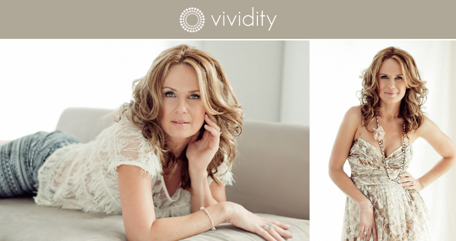
I shoot a lot of professional portraits for everyone ranging from doctors through to dancers. Everyone’s needs are slightly different, so I do customised shoots for each of my clients to create for them the images that they need. We do hair and makeup, shoot, select images, and then I retouch and provide those images in print and in digital format. My clients leave armed with enough to start growing their business profiles in print and on line.
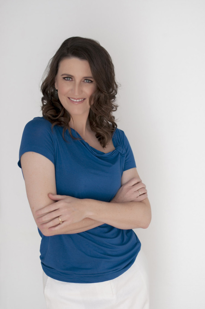
But here’s where the trouble (sometimes) begins. An image that was provided like this:
….gets cropped like this:
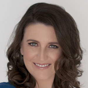
Not at all flattering, is it? Not nice at all. The worst one I’ve ever seen the person cropped their image so tightly that they looked like a decapitated head in a box. Really not nice.
Here are three tips that will help you get a good result when you upload your profile pic
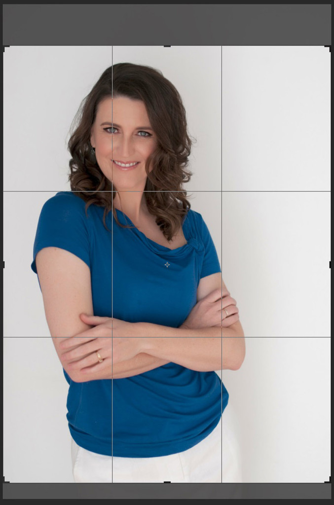
1. Rule of Thirds
Imagine a 3×3 grid over your image, dividing your image into thirds vertically and horizontally. Try to keep points of interest on those lines, or better yet, at the intersection of those lines. You get a stronger, more interesting and visually pleasing image that way. Here are two potential crops of the same image, both making good use of rule of thirds.
![]()
And here’s a third version that has my face right in the middle frame. It’s OK, and an acceptable profile pic, but it’s just a bit….well….boring.
![]()
2. Negative Space
Negative space is the empty part of the photo, the bit that’s ‘just background’…. the bit that’s not the subject. So in the images above, the negative space is the white part. Negative space is a powerful tool in art and design. Have you ever thumbed through the newspaper and seen a full page ad that is mostly white space? I bet it caught your eye amongst all that type on the rest of the pages. If you’re on instagram, have a quick scroll through someone’s gallery (and I mean that literally: make the images in their gallery scroll by at a reasonable pace) and see which images make you pause. My guess is it will be the ones that have more negative space than the rest of the images in that particular gallery. Here’s a screen shot of my instagram gallery. I bet I can guess which frame catches your eye the most.
![]()
Click here if you’d like to see more of vividity on instagram.
So what does this mean for your profile pic? Well, a little bit of empty space around you is not just wasted photographic real estate. It’s actually a great tool to help make your profile picture more captivating. Compare one of the tight crops from above to one with a little more negative space. Which do you find more appealing?
![]()

3. Use the correct file size and orientation
If you can find out the dimensions in pixels for the place where you are using your profile pic, great! Resize a larger image to those dimensions and you should be good to go. But whatever you do, don’t try to enlarge a smaller image to fit, especially if it has already been provided to you by your photographer as a low resolution file. You will end up looking like you’re made from lego bricks! The other thing to avoid is cropping too much. It will have the same effect. Here’s an example. This is the same image as above, at a low resolution for web use, but then (as many people do) cropped to just the head and shoulders.
![]()
Remember that a ‘head shot’ or ‘profile pic’ doesn’t necessarily have to be only your head. It is quite acceptable to use a head and shoulders, head and torso, or even a full length shot as your profile pic if you like. Personally, I don’t think it really matters too much across most platforms. What IS important, though, is that you don’t take a low resolution full body shot and crop it to just your head and shoulders. That’s when you will run into problems with pixelation.
There are also some sites that have less than friendly user interfaces that can make it difficult to upload your profile pic well. Sometimes you upload your pic, and it suddenly looks like this:
![]()
This is probably because the site is set to fill the allocated profile pic space with the file that you upload, and if your file happens to be smaller in one dimension, the site just stretches it out to fill the available space. Yuck. If this happens to you, try to find out the dimensions that are specified for the profile pic, and resize or crop your image to fit that size before you upload. If you have trouble doing that, contact your photographer. They should be able to do it for you. I even had one client recently where the user interface on the site she was using was so poor that she actually allowed me to log in on her behalf and upload the image for her. It took me three goes to get it right, and I work with images all day for my job.
And while I’m at it, here is one more tip for free.
4. #nofilter
Stay away from strong filters that come with some apps like Instagram and the built in camera app on your phone. If your photographer is worth their salt they will have spent considerable time making sure the colours of your corporate portrait make you look good. They will have done so on a colour calibrated monitor, possibly in a darkened room. If your image is black and white they will more than likely have made it that way by tweaking a lot of different settings individually, not but just desaturating the image (just taking out the colour information). So it’s probably best to just upload that image exactly as it is, and resist the urge to go all “Gingham”* or “Hefe-ish”* with it.
😉
Your photographer will thank you for it. And it will be so much more appealing to your target market, I’m sure!
* Names of popular filters in Instagram
PS: Need to update your own profile pic? Click here to get the ball rolling.